How to Calculate Monthly Active Users (MAU) with SQL

Monthly active users (MAU) is a common metric that many companies use to indicate the level of engagement with their website or app. A high number of active users on the company's website can be used as a proxy of demand for their product.
MAU is defined as the number of unique, active users on a website in the last 30 days.
Many analytics tools and packages (like Mixpanel, Google Analytics, Heap, etc) might include this metric as part of their standard offering but if you're building your app from scratch you might want to define your own. Lucklily this is easy to do with SQL assuming you have user interaction data logged in your application database or data warehouse.
For this recipe you'll need:
- 1 definition of user
- 1 definition of active
- 1 date dimension table (static or dynamically generated)
Before you begin, you'll need to define what you mean by user. Depending on your situation this can mean someone who's logged in, which is easy to identify if you make all your users log in before they can interact with your app. You need a uniqe identifier for this user, which could be something like user_name, email_address, login, etc.
Next you need to define the kinds of actions that constitute activities in your website or app. This can be any interaction like: viewing a product page, adding to cart, getting a quote, picking a date, checing availability, liking, disliking, following, subscribing, commenting, retweeting, viewing a product page, adding to cart, getting a quote, downloading a trial, etc.
Here's Twitter's definition:
We define monthly active usage or users (MAU) as Twitter users who logged in or were otherwise authenticated and accessed Twitter through our website, mobile website, desktop or mobile applications, SMS or registered third-party applications or websites in the 30-day period ending on the date of measurement.
Let's start simple nd build up from there. First we'll calculate the number of active users in the last 30 days from today. I'm using the BigQuery HackerNews dataset available here
select
    count(distinct hn.by) as active_users
from
    bigquery-public-data.hacker_news.full hn
where
    date(hn.timestamp)
    	between date_sub(current_date, interval 30 day) and current_date;
The hacker_news.full dataset contains all the various activities a logged-in user can do like post a story or a job, comment on a story, create a poll, etc. and each user is identified by their login (stored in the column by) so all we have to do is look back 30 days from today's date and count the distinct number of users.
But what if I wanted to pick an arbitrary date? Say I want to know how many users were active on December 1st 2021. We can simply plug in that date instead of current_date
select
    count(distinct hn.by) as active_users
from
    bigquery-public-data.hacker_news.full hn
where
    date(hn.timestamp)
    	between date_sub('2021-12-01', interval 30 day) and '2021-12-01';
Now what if I wanted to generalize this approach and get a chart to see how MAU changes over time?
In this case, we'd want to first create a Date dimension which is basically a table with a single column of consecutive dates. We can then calculate the MAU metric for every day of the period chosen and plot it.
BigQuery offers a nice function to generate this table as an array which we then have to unnest in order to turn it into a table. Here's an example of generating a Date dimension for the last 90 days using generate_date_array() function in BigQuery:
select dt
from unnest(
        generate_date_array(
       	    date_sub(current_date, interval 90 day),
            current_date
        )
) dt
Using a CTE we can cross join this table with our hacker_news data:
with date_series as (
	select dt
	from unnest(
	        generate_date_array(
	        	date_sub(current_date, interval 90 day),
	            current_date
	        )
	) dt
)
select
    ds.dt,
    count(distinct hn.by) as active_users
from
    bigquery-public-data.hacker_news.full hn
    cross join date_series ds
where
    date(hn.timestamp)
        between date_sub(ds.dt, interval 30 day) and ds.dt
group by 1;
and produce this table:
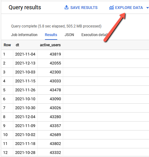
And using the Explore Data link we can use Gogle Data Studio to plot this data and see what it looks like:
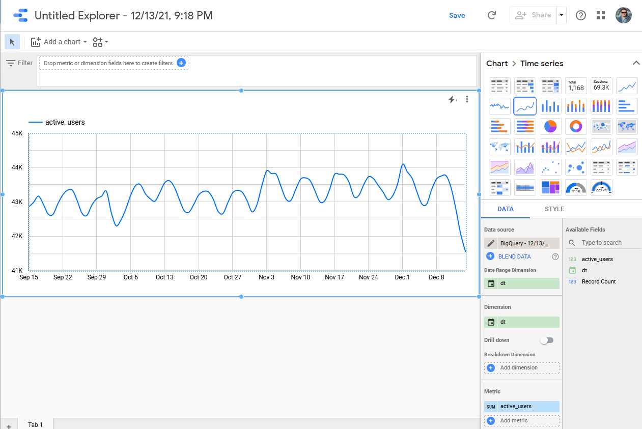
It's looking pretty steady. Way to go HackerNews!